Textured ceramic tiles are moving beyond basic decoration. They now combine tactile relief, realistic stone effects, and digitally printed surfaces. ACIMAC’s World Production and Consumption of Ceramic Tiles report recorded global tile production at approximately 16.8 billion square meters in 2023. That scale raises expectations for consistency, detail, and reliable quality control. Buyers notice small defects, especially across large-format walls and hospitality interiors.
The practical question is clear: How to achieve high-resolution patterns on textured ceramic tiles without losing detail in the valleys or creating excessive ink on the peaks? The answer depends on surface mapping, glaze behavior, ink viscosity, and firing control. Digital printing systems can place fine droplets accurately, but texture changes the distance between the printhead and tile surface. Even a slight variation may soften lines or produce uneven color density. It happens more often than manufacturers admit.
This guide examines proven methods used in ceramic production. It considers surface preparation, relief depth, digital calibration, glazing, and post-firing inspection. ISO 10545 testing standards provide useful references for tile performance, although they do not solve every printing challenge. Technical teams should combine laboratory testing with production-floor experience. Grand View Research identifies continued growth in the global ceramic tiles market, increasing pressure for premium visual quality and lower waste. However, no single setting works for every clay body or texture. That assumption needs reconsideration. A sharp sample may still fail after full-scale firing. Small test panels, measured color data, and repeated trials remain essential.
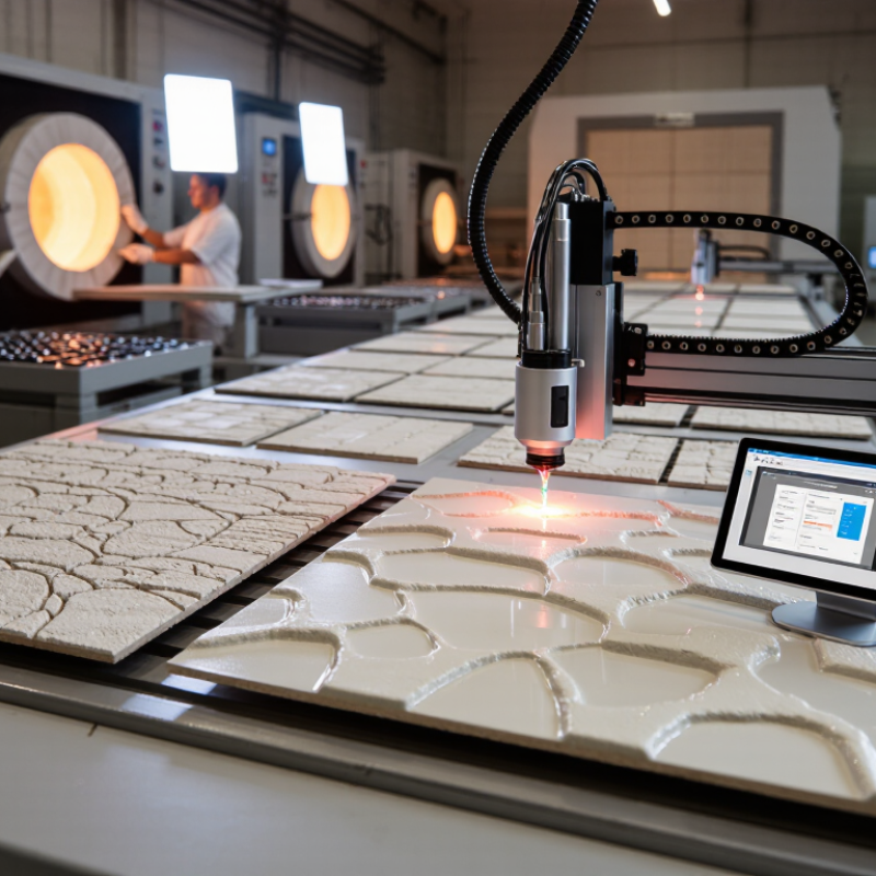
High-resolution patterns on textured tiles begin with surface selection, not software. I test a spare tile under angled light before preparing artwork. The glaze should have controlled texture, with no deep pits that swallow fine lines. Smooth raised areas help preserve small text and sharp edges. Very rough surfaces create broken details, uneven color, and visible gaps in curved patterns. A practical test uses a 1 mm grid, tiny lettering, and a skin-tone gradient. If the grid disappears in the valleys, the tile is not ready for detailed printing.
The coating must match the tile body, ink chemistry, and curing method. A compatible primer can improve wetting and reduce pinholes on textured surfaces. Apply it evenly; pooled coating rounds sharp texture and changes the pattern. Measure coverage across the tile, especially near the edges. After curing, check adhesion with controlled rub and tape tests. The surface should feel sealed, not glassy or sticky. A glossy finish may deepen dark colors, while a matte finish can soften contrast. Neither is automatically better.
In production, I keep the print head distance consistent and lower speed when texture varies. Registration marks help reveal stretching or movement during printing. I also compare a coated sample with an uncoated control. One mistake I made was trusting a beautiful center area. The edges later showed weak adhesion and pale lines. That failure changed my workflow: inspect corners, valleys, and raised ridges before approving the full run. Leave time for curing. Rushing it can ruin excellent detail.
| Tile Surface | Typical Surface Characteristics | Practical Print Resolution Range | Recommended Coating or Pretreatment | Ink Absorption and Dot Control | High-Resolution Pattern Suitability | Key Quality-Control Checks |
|---|---|---|---|---|---|---|
| Smooth Glossy Glazed Ceramic | Low porosity, reflective finish, and relatively even surface profile. | 600–720 dpi for fine lines, small text, and detailed decorative patterns. | Clean and dry thoroughly. Use a coating that is chemically compatible with the selected ceramic, UV, or water-based ink system. | Very low absorption supports sharp edges, but excessive ink can cause pooling, smearing, or poor adhesion. | Check surface cleanliness, ink adhesion, color density, glare, and line-edge sharpness after curing. | |
| Matte Glazed Ceramic | Micro-rough surface that diffuses reflected light and can slightly soften printed edges. | 360–600 dpi; use controlled ink limits for small details. | Apply a thin, uniform compatible primer or digital glaze only when required by the ink system. | Moderate surface texture can spread the ink slightly. Lower ink volume often improves detail retention. | Measure color uniformity, inspect fine lines under magnification, and verify that the coating does not fill the matte texture. | |
| Fine-Grain Textured Glaze | Small repeating texture that creates local height differences and variable gloss. | 360–600 dpi, with pattern scaling adjusted to the texture pitch. | Use a thin leveling or bonding layer that preserves the intended texture. Avoid heavy coatings that obscure relief. | Ink may collect in recesses and become thinner on peaks, producing local density variation. | Evaluate highlight and shadow areas, registration across the texture, coating thickness, and repeated pattern consistency. | |
| Structured or Embossed Ceramic Tile | Raised and recessed areas with noticeable height variation and changing print distance. | 300–600 dpi; avoid overly fine details that are smaller than the relief features. | Use a flexible, well-bonded primer or protective clear layer where compatible. Apply uniformly without leveling the relief. | Uneven stand-off distance can cause dot-size and color-density changes between peaks and valleys. | Check printhead clearance, edge coverage, ink adhesion on peaks, recess filling, and pattern registration over the entire tile. | |
| Unglazed Porcelain | Very dense mineral body with low water absorption but a naturally porous or micro-textured surface. | 300–600 dpi, depending on the ink system and required color saturation. | Use a compatible pore-sealing primer, bonding coat, or base glaze before high-resolution printing. | Unsealed micro-pores can reduce edge definition and cause uneven color density. | Test absorption, wipe resistance, scratch resistance, color density, and adhesion after the full curing cycle. | |
| Highly Porous Terracotta or Earthenware | Open pores and comparatively high liquid absorption; surface may also be uneven. | 180–360 dpi unless the surface is sealed and leveled effectively. | Apply a suitable sealer or base coat, then allow complete drying or curing before printing. | Rapid absorption can enlarge dots, reduce contrast, and make fine lines appear soft. | Measure coating uniformity, absorption rate, edge spread, drying behavior, and resistance to handling or cleaning. | |
| Polished Porcelain | Very smooth, dense, and reflective surface with minimal absorption. | 600–720 dpi for high-detail patterns when the surface is properly cleaned. | Use a strong-adhesion primer or compatible bonding layer; remove polishing residue before coating. | Excellent dot definition is possible, but poor surface preparation may cause pinholes, fisheyes, or adhesion failure. | Check surface energy, residue removal, wetting, adhesion, gloss variation, and resistance to abrasion or chemicals. | |
| Slip-Resistant Anti-Slip Surface | Pronounced granules or irregular texture designed to increase traction. | 180–360 dpi for reliable coverage; use larger graphic elements where possible. | Use a flexible, wear-resistant coating that follows the surface profile without blocking anti-slip performance. | Texture interrupts continuous ink coverage and can create highlights, gaps, and uneven dot placement. | Verify wet and dry slip performance, coverage on peaks and valleys, cleanability, abrasion resistance, and visual uniformity. |
Note: The resolution ranges are practical starting points for digital ceramic and tile-printing workflows, not universal material limits. Final settings should be confirmed with a printed test tile because ink chemistry, coating thickness, curing method, texture depth, and printhead height strongly affect image quality.
Test a spare tile under angled light. Print a 1 mm grid, tiny lettering, and a skin-tone gradient. If grid lines vanish in valleys, choose a smoother surface. Deep pits swallow detail.
Controlled texture works best. Smooth raised areas keep small text and sharp edges visible. Very rough tiles may create broken lines and uneven color. The center can look perfect, while corners fail.
Match the coating with the tile body, ink chemistry, and curing method. Apply a thin, even layer across the entire tile. Pooled coating can round sharp texture. Check the edges carefully.
A compatible primer can improve wetting on textured surfaces. After curing, perform controlled rub and tape tests. The surface should feel sealed, not sticky. I once trusted the middle too much.
Start with several small ink levels. Slightly lower ink volume may protect narrow lines. Heavy deposits can fill valleys and soften patterns. Texture can hide weak coverage from a top view.
Keep the tile surface consistent during testing. Check neutral tones, gradients, and skin-like colors. Strong contrast may improve clarity, but excessive saturation can cause bleeding. Screen previews can mislead.
Keep print-head distance consistent. Lower the printing speed when texture changes noticeably. Use registration marks to detect stretching or movement. Record temperature, tile batch, ink level, and curing time.
Inspect raised ridges, valleys, edges, and corners under angled light. Photograph the surface before testing. After cooling and cleaning, apply a thin compatible sealer. Test wiping, detergent, moisture, and abrasion on spare tiles.
Inspect them after 24 hours, seven days, and repeated cleaning cycles. Some defects appear after cooling. Gloss may change under different light. My first test plan is rarely perfect.
Achieving crisp, detailed graphics on textured ceramic tiles requires careful control at every stage. The process begins with choosing a tile surface that has a suitable texture, absorption level, and coating compatibility for high-resolution printing. Before applying the pattern, the tile should be thoroughly cleaned, dried, and positioned accurately so uneven areas do not distort the design. A suitable digital printing method should then be selected to maintain fine lines, smooth color transitions, and consistent coverage across raised and recessed surfaces.
To understand how to achieve high-resolution patterns on textured ceramic tiles, it is also important to balance ink viscosity, color density, and curing conditions. These settings help prevent bleeding, fading, or loss of detail. After printing, each tile should be inspected under consistent lighting and tested for adhesion, clarity, and durability. A protective finish may then be applied to preserve the pattern while maintaining the tile’s texture and appearance.

 DD-Tech Print