Why are my printed colors looking dull on ceramic surfaces? This question plagues many artists and professionals in the ceramics printing industry. According to Dr. Emily Hart, a renowned expert in ceramic ink applications, “The vibrancy of colors can be affected by surface texture and the type of ceramic used.” Her insights shed light on a common issue faced by many.
Ceramics have a complex relationship with ink. The glossy surface may seem ideal, but it can actually mute colors. Different ceramic materials each react uniquely to printed inks. For instance, porous surfaces absorb ink differently than smooth ones. This absorption may lead to duller appearances.
Understanding the science behind color application on ceramics is crucial. Even minor imperfections in the printing process can result in unexpected outcomes. Color mixing, ink quality, and even firing temperatures also play significant roles. As artists and printers explore these factors, they can improve their results. Reflecting on their techniques can lead to greater success in achieving vibrant prints.
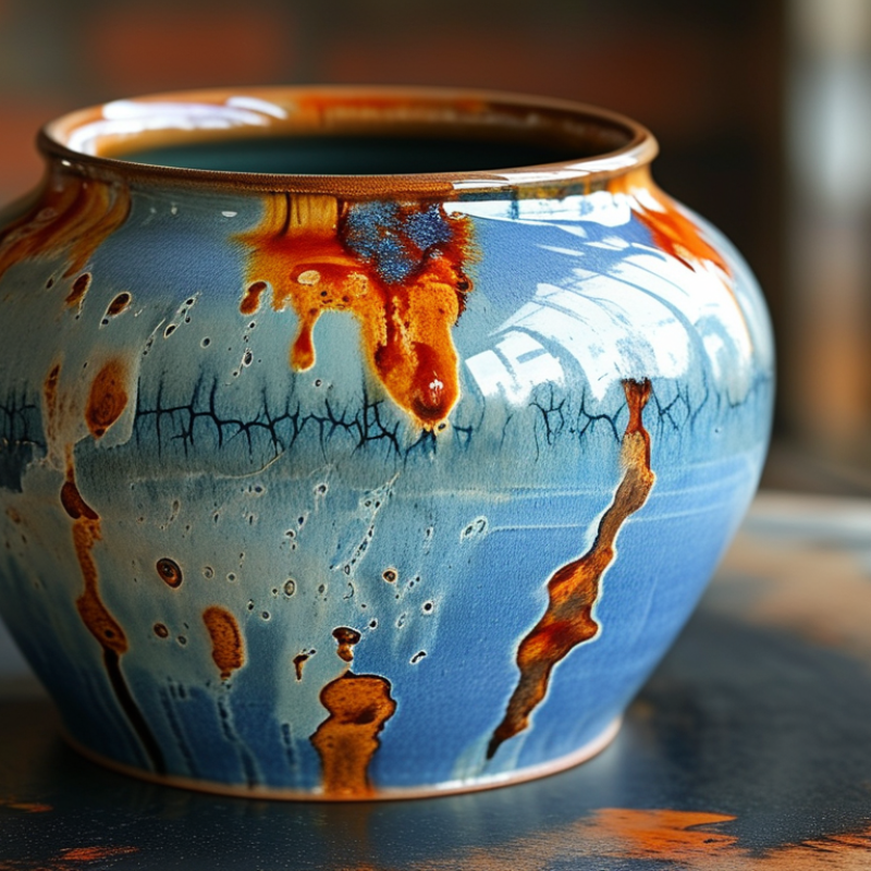
When printing on ceramic surfaces, several factors can impact color vibrancy. The type of ceramic used plays a significant role. Different ceramics have distinct glazing properties that affect how colors appear. For instance, more porous ceramics can absorb inks differently. This absorption can unexpectedly dull colors, making the print look less vibrant than intended.
Another crucial factor is the printing technique. Techniques like sublimation or direct-to-garment can yield varying results. Using an inadequate resolution can also cause blurriness in colors. Even slight imperfections during the printing process can affect overall quality. Additionally, the environment where the printing occurs can impact outcomes. High humidity or fluctuating temperatures can alter ink behavior, leading to inconsistent results.
Choosing the right inks is essential as well. Certain inks may not adhere well to all ceramic surfaces, resulting in lackluster prints. Professionals often experiment with different combinations to achieve desired effects. Even experienced printers may face challenges with color vibrancy. Reflecting on these factors can help improve future projects, ensuring a more vibrant outcome.
| Factor | Description | Impact on Color |
|---|---|---|
| Surface Texture | Rough or porous surfaces can absorb more ink, leading to dull colors. | Increased absorption can reduce vibrancy. |
| Ink Quality | The type of ink used affects how colors appear on ceramic. | Higher quality inks produce more vibrant colors. |
| Firing Temperature | The temperature at which the ceramic is fired can alter color intensity. | Improper firing can lead to faded or dull colors. |
| Colorant Type | Different colorants behave differently on ceramic surfaces. | Some colorants yield brighter outcomes than others. |
| Coating and Finish | The type of coating applied can enhance or dull colors. | Glossy finishes can enhance color vibrancy. |
| Lighting Conditions | The lighting under which the ceramic is viewed affects color perception. | Dim lighting may make colors appear duller. |
: Dull colors often result from the unique properties of ceramics, which absorb inks differently.
Not all inks work well on ceramics. Using standard inks can lead to muted tones.
Poorly prepared surfaces can hinder ink adhesion, resulting in uneven color distribution.
Insufficient temperature or pressure during printing can lead to poor ink transfer and dull colors.
Incorrect firing temperatures may dull printed colors or alter their appearance entirely.
Different glazes interact uniquely with inks, influencing final color vibrancy.
A smoother surface texture can increase color brightness significantly, often over 30%.
Testing samples helps check material compatibility and predict color results before larger runs.
Even slight variations in the firing cycle can lead to unexpected color outcomes.
Continuous learning and adjustments based on past prints can lead to better color vibrancy over time.
When considering the question, "Why are my printed colors looking dull on ceramic surfaces?", it is essential to understand several factors that affect color vibrancy. The characteristics of ceramic materials themselves, such as their surface texture and porosity, play a crucial role in how colors appear. Additionally, the printing process, including the type of inks and techniques used, can lead to common issues like inadequate adhesion or insufficient curing that contribute to dullness.
To enhance the brightness of printed ceramics, various techniques can be employed, such as selecting high-quality inks and optimizing printing settings. Furthermore, preparing ceramic surfaces properly before printing—ensuring they are clean and appropriately primed—can significantly improve the final appearance. By addressing these factors, one can achieve more vibrant and attractive prints on ceramic surfaces, ultimately answering the question about dull colors effectively.